Wednesday, April 28, 2010

Robin Update (end of April 2010)

When I got home from the Paducah quilt show, I rushed to my bedroom window to check on the progress of my baby robins. This is what I found...
Well, I guess I should clarify that a bit. My friend and I went to check the nest, and three mostly grown up birds stared back at us and flew down to the ground. When I first started writing about the robins, I told you there were four eggs, and I only saw three babies. This is the egg that didn't hatch. I did later see one of the babies in a bush by my window. The picture isn't great, but I thought you might like to see how one of "the kids" turned out.
Now...while I'm on the subject of birds and babies...this is what I found outside my bedroom window when I went to the Paducah quilt show. The bird had built this nest between some wood and the glass of the window. It was literally like having the view of a nest cut in half. This would have been great for an elementary science class observation. This is what I saw when I arrived...
...and this is what I saw the day I left...
Now...how cool was that!

Tuesday, April 27, 2010

AQS Quilt Show--Paducah 2010

Here are some more pictures and happenings before and during the AQS Show in Paducah, KY (2010). In this first picture, you can see a bit of the downtown welcome that quilters coming to Paducah receive.
Libby made a real fuss about me heading out again so soon after the Chicago show. I guess she thought if she sat on my suitcase I couldn’t go—or maybe she was thinking she might stow away to the show with me!
I did get permission to post these pictures of quilts from Paducah. As my friend and I were checking out the quilts at this year’s show and oooooing and ahhhhing over this quilt, a Japanese lady stepped up to us and said what amounted to, “This is my quilt.” She didn’t speak English very well, but you could tell that she was very proud (as well she should be) that her quilt was accepted into the show. Her name is Mitsuko Suto, and she is from Sendai, Miyagi Japan. Her quilt, “25th Anniversary” is shown below.
The next quilt maker we met was Valeta Hensley from Flemington, MO. She was SO nice. Her quilt, “Fashionable Ladies of the ‘20s,” was the “Best Wall Quilt” winner (sponsored by Moda). It is a purchase award, so she said she will be visiting the quilt at the museum. The three lower panels (that the ladies are on) are made of a tapestry material. The fabric at the top of the quilt is not made of the same fabric; I think she said it is a regular 100% cotton fabric. We talked about how well she matched the two fabrics.
I got to meet the authors of two of my favorite books. First, Maria Peagler, the author of “Color Mastery: 10 Principles for Creating Stunning Quilts” was vending in the same building as a friend of mine (Betty from The Village Mercantile in Boonville) in downtown Paducah. I had won a bundle of fat quarters from Maria last year and made a small Lori Smith quilt from it. She really had a rough time in Paducah; read about it at this address http://quiltsandcreativity.com/my-emotional-week-at-paducah. Maria was nice enough to pose with me for a picture. This was REALLY nice considering what she was going through.
The next author I got to meet was Lyric Kinard. If you follow my blog regularly, you know that I’m working through Lyric’s book, “Art + Quilt.” My friend, Robin, and I took a Surface Design Sampler class from her. We had a great time and learned a lot. We had a chance to sample foiling, screen printing, painting, making stencils, transferring images using Citra-Solve, beading, and making and using a stamp cut from an eraser. We had a great time experimenting. Lyric had pictures of the class on her blog a couple of days ago. Check them out here http://lyrickinard.blogspot.com/2010_04_01_archive.html#9210018291540454489.
Now, under my “oh, the things you’ll see at a quilt show” category are these hats. We were all shopping in the back room of Hancock’s. These ladies were nice enough to let me take their pictures.
Check back. I'll be posting more pictures from Chicago, and I have an update on the robins and another bird's nest.

Sunday, April 25, 2010

Beth/Lyric Project Week 11 (Focal Point through Placement, Isolation, and Contrast)

As a reminder to those of you that don’t normally keep up with my blog (if you do, skip to the next paragraph), I have started a project that I’m calling the Beth/Lyric Project. In the spirit of the movie “Julie/Julia,” (i.e. Julie working through Julia Child’s cookbook) I have decided to work through the exercises in Lyric Kinard’s “Art + Quilt, Design Principles and Creativity Exercises” book. My goal is to get at least one of the exercises done each week. I’ll be posting my progress on Sundays. I’d love for you to work along with me. If you decide to do that, please post and let me know how you’re doing—send pictures too! If you have trouble leaving a comment on my blog, email me at  bschnellenberger@gmail.com.

For this week’s exercise, we were instructed to make three compositions using “several shapes to work with and repeat them for each piece.” We were to use “a different tool to create focal points each time.”

The first “assignment” was to “use placement of shapes and lines to lead the eye to a focal point.” For Composition 1, the eye is drawn to the central element of this piece by the shape and lines of the elements radiating from it. The emphasis is created by leading the eye to the “eye” of the piece.
For Composition 2 the “assignment” was to “use isolation to create a focal point.” In this piece, the bottom triangle is identical to the elements above; but simply by setting it off, it becomes the focus. I placed it so (to me) it looks like the triangle is trying to head back to its “proper” location. The contrast here is a contrast of placement—not form.
Composition 3 was to “use contrasts of color, texture, or size to create a focal point.” Originally, I thought the focal point would be the circle (variation in shape) because of the linear nature of the other elements, but MY eye is drawn to the white parallelogram. For that reason, I used this composition to satisfy the “assignment” of using “contrasts of color” to create a focal point. What draws your eye? Please comment at the bottom of this page or at my email address. (bschnellenberger@gmail.com)
We were instructed to ask ourselves…
  • How could you rearrange the elements to create a stronger path for the eye to follow?
  • Is there a color or value that stands out from the rest of the piece?
  • Does something look different from all the rest?
  • How could your stitching and embellishments add to the strength of your focal point?
I didn’t have time to stitch these pieces, but I definitely think stitching would strengthen the focal point for Composition 1—probably all the pieces.

Come on…join me in this adventure of working through the exercises in the Art + Quilt book. I’m learning SO much; I bet you will too! Next week I’ll be working on “Balance and Color.” It is on Page 63 in the book. Look for the post next Sunday.

Saturday, April 24, 2010

Back from the AQS Show in Paducah (2010), Pictures on Lyric Kinard's Blog

I just got back from the AQS Quilt Show in Paducah, KY. I thought I'd share my "quilt booty" with you once again. My "haul" is much smaller than it was from the Chicago show (thankfully). I did get some great fabric from Hancock's of Paducah (for $3.98 a yard) and a nice piece from another vendor booth, I also picked up a Thermore batting, Clover "Black Gold Needles" for applique, applique pins, a Patchwork and Quilting "Anti-skid Place Mat" made by Bohin (that I'm thinking will be great to use instead of sandpaper when copying applique shapes to fabric), a Shibori jacket, two sample packs of batting (just the right size to use with my Beth/Lyric Project exercises), 2 yards of Lite Steam-a-Seam 2, a book ("Creative Dyeing for Fabric Art with Markers & Alcohol Inks), Kai 4 3/4" Patchwork Scissors with a micro-serrated edge, Kai 8 1/4" Patchwork Scissors with a micro-serrated edge, and a Clover Thread Pic (for hiding or removing stray threads from quilts).
Here is a closeup of my favorite fabric purchase.
All in all it was a good show, however...

I'd like to "vent" about the limitations on posting pictures from this AQS Quilt Show. The "powers that be" at AQS required permission from the artist of the quilt and AQS before any pictures of the show could be posted on the Internet. That makes it virtually impossible to post photos of the quilts unless you run into the artist at the show. I try to take pictures of quilts that people might not otherwise get to see. I don't generally take pictures of the award winners, because I feel that people will probably see those in magazines and such. I like to share the beautiful quilts that aren't fortunate enough to make it to the "Winner's Circle." That may be the only opportunity for those people that can't get to the show to see them. I did speak to two quilt artists and have photos of their quilts to share on my blog (with permission, of course). If I was one of the quilt artists that didn't win an award, I would be happy for people to get to see my entry. I'm thinking other artists feel that way too. On that note...

I had one of the artists from the "Fiber Twenty Ten" fiber arts show at The Foundry Art Centre in St. Charles, Missouri, write a really nice comment about my pictures of that show. You can link to Elizabeth Lundberg Morisette's blog (called re/collections) here http://elmorisette.blogspot.com/2010/04/fiber-twenty-ten-review.html. She is the artist that made one of my favorite pieces in that show. You can see my pictures from the show at http://quilterbeth.blogspot.com/2010/04/virtual-fiber-arts-show-from-foundry.html if you missed them.

While I was in Paducah, I got to take a Surface Design Sampler class from Lyric Kinard. Needless to say, it was a wonderful class. Much to my surprise, she already has pictures of her Paducah classes on her blog--AND MY PICTURE IS THERE! Check it out at http://lyrickinard.blogspot.com/2010_04_01_archive.html#9210018291540454489. I'll be sharing my pictures of the class along with comments ASAP. Obviously, she is much more organized than I am to get her photos up so quickly! Hmmmm...no surprise to me!

I will be posting my TWO pictures of quilts from the show (along with pictures of some other things I saw and did) and more pictures from the Chicago show as soon as I can. Please check back.

Tuesday, April 20, 2010

Robin Update

This morning I got a snapshot of the baby robins waiting to get fed. The mother had just landed and was ready to feed them when she spotted me. She quickly flew off, but I got a picture of the babies with mouths wide open. The shot is a little blurry, but you can tell there are three babies--and they are HUNGRY!

More from the International Quilt Festival (Chicago, 2010)

These are a few more pictures I took while I was at the Chicago International Quilt Festival held at Rosemont, IL.

“Pineappluchious” was made by Mary Beth Clark, from South Elgin, IL. Techniques: Paper pieced, appliquéd. Design Source: The inspiration for this quilt is the juicy joy of a sliced aromatic pineapple. It is amazing that we have wonderful produce year round. When in midwinter I can enjoy a juicy aromatic pineapple, I just have to rejoice with fabrics!

I loved the variety of yellows and greens used in this quilt. It really does look like pineapple slices.
“Spring Burning” was made by Ruth Powers from Carbondale, Kansas. She says, “Fire is an element of terrible beauty, at once beneficial and destructive. Whether started by lightning or man, it renews the land, encouraging the new shoots to emerge and insuring one mere season of lush grazing.” Techniques: Machine piecing, machine quilting (Bernina free-motion, non-regulated), extensively hand beaded. Materials: 100% commercial cottons, assorted threads and beads. Design Source: Original design.

The color and movement depicted in this quilt caught my eye.
“Evening Dandies-Lions, That Is!” was made by Leigh Layton from Indianapolis, Indiana. She says, “A wonderful batik spoke to me of lion faces and manes. I could just see them as dandelion blossoms ready to go to seed. Techniques: Machine appliqué, thread painting, beaded embellishment. Materials: Cotton fabric, batting, beads. Design Source: Original design.

This quilt made me smile. If you click on the picture to get a close up, you can see faces in the flowers.
“Vertigo” was made by Diane Nunez from Southfield, Michigan. Techniques: Wholecloth quilted, assemblage. She says, “I suffer from vertigo and spend a lot of time looking at life spinning by. Each episode is different; I never see things the same. Colors are constantly whirling. The movement I see is dimensional. This quilt was created to illustrate my perception.

The vibrant colors and the dimension drew me to this quilt.
“Rainbow Poppy” was made by Carol Schuetz, from Indianapolis, Indiana. Techniques: Disperse dyed, machine quilted, beaded. She says, “I love flowers, especially their colors, and I am uplifted by their beauty. I manipulated my poppy digital photo with Adobe Photoshop Elements and arrived at this design after working through many others. I see this as a rainbow poppy in my mind, and it makes me happy.

This quilt reminded me of a stained glass window.
These girls made me smile. I asked if I could take their picture, and they kindly gave me permission. I put them in the category of "Oh the Sites You'll See at a Quilt Show." They explained to me that they had come to the show before and once they had "fanned out to shop" they really had a hard time finding each other. They said with this "outfit," they could easily find each other. All they had to do was ask anyone if they had seen the lady with the bunny ears and tiara. If they had been spotted, people remembered!
I'll be posting more pictures as I get them edited. I'm heading to the AQS Quilt Show in Paducah, though, and won't have time till I get back. Enjoy.


Monday, April 19, 2010

Pictures of the Hoffman Challenge 2009 from the Chicago International Quilt Festival 2010

I took some pictures while I attended the Chicago International Quilt Festival. I'll be sharing them with you as I get them edited.

These are some of the quilts on display with the 2009 Hoffman Challenge.
The quilt above is called “Pineapple Paisley” and was made by Martha Mook from Fort Pierce, Florida. It won the Best Hand Workmanship-Mixed Technique award in the Hoffman Challenge.
“Royal Radiance” was made by Dottie Lankard from Independence, Kansas. It took the Second Place-Pieced award in the Hoffman Challenge.
“Paisley Promises” was made by Diane Magarelli, QP53, QC-F. She says, "It is an original design that is part of a series which I began in 2005 exploring different ways to add dimension. The first technique I developed used supporting triangles that were outside of the quilt and visible. This technique keeps the supporting mechanism out of view." PERSONAL COMMENT...This quilt had a three-dimensional border that was supposed to stand out from the quilt—sort of like looking down into the lid of a shirt box . The people who hung the show hadn’t pulled the border out (or they had tried to pull it out and it hadn’t stayed), so the triangles were not “pulled” into position. This caused the quilting motif between the pieces to be off center and caused some of the bottom pieces to be partially covered by that three-dimensional border. It was all I could do not to fix this. Other people around me as I viewed this quilt said the same thing.
“Birds” was made by Tami Jones from Allentown, Pennsylvania. This quilt was “stuck” way in the back of the exhibit. It was really a pretty little quilt, but I’ll bet a lot of people missed it because of the placement. What a shame.

I'll be posting more of my pictures as I get time. Stay tuned...


Sunday, April 18, 2010

Beth/Lyric Project Week 10 (Unity through Repetition)

As a reminder to those of you that don’t normally keep up with my blog (if you do, skip to the next paragraph), I have started a project that I’m calling the Beth/Lyric Project. In the spirit of the movie “Julie/Julia,” (i.e. Julie working through Julia Child’s cookbook) I have decided to work through the exercises in Lyric Kinard’s “Art + Quilt, Design Principles and Creativity Exercises” book. My goal is to get at least one of the exercises done each week. I’ll be posting my progress on Sundays. I’d love for you to work along with me. If you decide to do that, please post and let me know how you’re doing—send pictures too! If you have trouble leaving a comment on my blog, email me at bschnellenberger@gmail.com.

This week’s exercise dealt with “unity through repetition.” I had to choose a contrasting piece of fabric to my background, cut out a number of identical shapes, arrange them in a repeating pattern on the base fabric, and rearrange them several times until I could find a pleasing composition.
  • “How much repetition is too much?”
  • “What would make this composition more interesting?”
  • “What would happen if you varied one color or shape?”
  • “How much can you vary each shape and still have a unified composition?”
After considering the questions, I was asked to do the exercise again adding the maximum amount of variety without losing unity. This is what I came up with. I think it is more exciting than the first piece. It is a “happy” quilt; it makes me smile.

Next week's exercise is on "Focal Point through Placement, Isolation, and Contrast." Join me...I'm sure you'll learn something. The exercise is on Page 59 in Lyric Kinard's "Art + Quilt" book.

This week, I will be taking a class that Lyric is teaching at the AQS Quilt Show in Paducah, KY. I'm hoping to have some pieces to show you from that class. I'm very excited to be able to learn some of her surface design techniques. FYI...Since I'll be gone a lot of the week, I will probably be late posting my exercise for next week.

Update on My Robin's Nest

I checked on "my" baby robins this morning and found this...
The "little ones" have added a lot of down to those previously pink, naked bodies. I still can't tell how many there are--at least two, though.

While I was taking this picture, a proud parent tried to fly in a worm to feed the babies. She (maybe he) was a little miffed that I was "disturbing" the babies. Check out those ruffled feathers!
If you look real closely, you can see the worm.

International Quilt Festival (Chicago 2010) "Quilt Show Booty"

I just got back from the International Quilt Festival in Chicago yesterday (April 17, 2010). I had such a good time.


First...a little Show & Tell. Here is my "quilt show booty." I "plundered" many a booth!
I bought solid fabrics (because I really don't have enough for the art quilts I'm working on these days and because they were only $1.50 per bundle). I got patterns, paints, earrings, discharge paste, a glue pen, Fray Block, a second Bendable Bright Light (because I'm too lazy to move it from one machine to another and because at $38 the price was too good to pass up--the "regular price" is $49.99), white and off-white natural silk, colorful fabric remnants, patterns, an Exacto knife, a quilt mailing tube, Citra-Solve, and an applique DVD...among other things.
...more patterns (I got 10 of them for $20--you just can't beat that price. I got all of these for $2 each except for the vest pattern.)...
Oh...this is more "booty" I just found...scissors, Texture Magic, a pin cushion (the last in a series of three from Country Threads), graffiti fabric (I LOVE, LOVE, LOVE this fabric designed by Stephanie Brandenburg from the Fern Hill booth.), a table runner kit using more of her gorgeous fabric, and a "Frosted Donut" of prewound bobbins from Superior Threads (for doing applique when traveling).

...and this doesn't count the "stuff" I got at The Container Store and Ikea. Also, I purchased the embroidery bag from the Tutto booth (which they will be shipping to me). It is a good thing I only go to two big quilt shows a year. Now...to find time to put all this stuff away...and then to use it!

Wednesday, April 14, 2010

Virtual Fiber Arts Show from the Foundry Art Centre in St. Charles, MO

I recently visited St. Charles, MO, and its Foundry Art Centre. I felt fortunate to happen upon a great exhibit in their Gallery I & II. The current exhibit is called Fiber "Twenty Ten." The exhibit contains quilts, some 3-D fiber art, and some mixed media pieces. It will be available for viewing till May 14 with an opening reception being held on Friday, April 16, 2010, from 6-9 p.m. Check out their website for more information (http://www.foundryartcentre.org/) I asked permission to take some pictures to share with you. I tried to take pictures of a variety of fiber art's media. Here they are...

This piece was made by Patrick Nolan, St. Charles, Mo. It is titled “Galaxy” and is made from a recycled crazy quilt with buttons, costume jewelry, wire, etc. I couldn’t quit looking at this quilt. There was SO much to see.
I took this close up so you could get an idea about how much “stuff” is on this quilt. The squares and rectangles with black around them are three-dimensional, stuffed little pillows surrounded by what looks like black wool.
James Jagodzinski made “My Mother’s Eyes.” He is from Balto, MD. I love the variety of fabrics he used to make this piece.
Katherine Sands from Carmi, IL, made “…But Words Will Never Hurt Me #2.” I love the name of this quilt (one of the better names I’ve seen--it actually makes sense when viewing the quilt). The quilt is made from fiber decorated with dye, paint, and ink. You can see from the pictures the blue “stones.” The “sticks” are painted all around the "stones." Words are written all over the piece. I’m really “into” pieces with words, so I really like this one. I took a close up so you could see the elements of the piece a little better.
This piece drew my eye because it was so light and airy. It is mounted on a plexiglass frame which doesn't distract at all from the piece. It makes it look like it is floating. The piece is called “Grass” and was made by P. A. Moore from Carmel, CA. It is knitted lace. The colors didn't photograph very well; they are really much prettier in person.
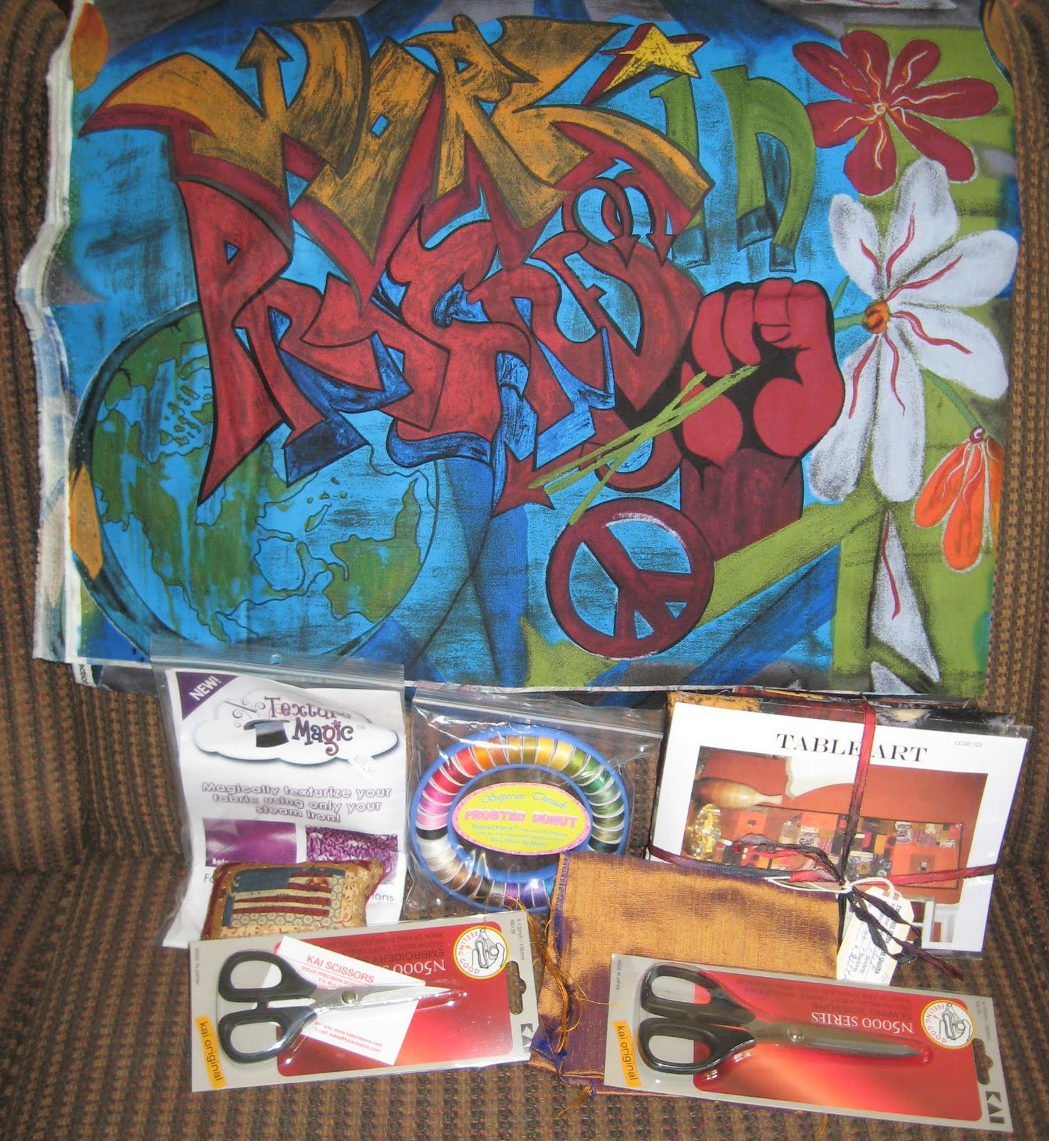
Lialia Kuchman from Chicago, IL, made “Turtle.” This piece is a fiber tapestry. I like it because the colors are so brilliant. It reminds me of graffiti (which I’m really into these days).
The next two pieces were made by Naomi WanJiku from San Antonio, TX. Both pieces are made using fabric and yarns. The first is called “Serenity;” the second is called “Moon Dance.”
This is a close up.
“Growth I” was made by Jesse Fair from Slate Hill, NY. It is a mixed media piece that is needle felted, painted, and hand dyed.
Bob Adams from Lafayette, IN, made “Subdued Interplay.” There were no more details about the piece—no clue as to how the piece was made. I took a close up of it, because I found the stitching to be most interesting.
Elizabeth Lundberg Morisette from Fort Collins, CO, made “Chamber Pot.” This 3-D piece is made with zippers and thread. I really wanted to touch this piece (but didn’t). I like it a lot; I think it is very creative. 
“Cellular Dance II” was made by Karen Kamenetzky from Brattleboro, VT. The piece is made from artist dyed and painted cotton and silks and is embellished with yarns. It is hand and machine stitched.
Anne R. Parker c/o Reid Lewis from Belton, TX, made “Ribbons of Joy.”
Debo Crites from Columbia, MO, made “Vertical Landscapes.” It is constructed out of paper and rope.
I also took a close up of this one.
All in all, it was a good show. I'm really glad I stumbled upon it. Be sure to check out the Foundry Art Centre if you are ever in St. Charles. Let me know if you enjoyed this virtual visit.