As a reminder to those of you that don’t normally keep up with my blog (if you do, skip to the next paragraph), I have started a project that I’m calling the Beth/Lyric Project. In the spirit of the movie “Julie/Julia,” (i.e. Julie working through Julia Child’s cookbook) I have decided to work through the exercises in Lyric Kinard’s “Art + Quilt, Design Principles and Creativity Exercises” book. My goal is to get at least one of the exercises done each week. I’ll be posting my progress on Sundays. I’d love for you to work along with me. If you decide to do that, please post and let me know how you’re doing—send pictures too! If you have trouble leaving a comment on my blog, email me at bschnellenberger@gmail.com.
In the “Line Weight” exercise, I was instructed to “gather many different weights of thread in one color range,” “lay out parallel lines of threads and cords,” “rearrange them until” I hit upon a pleasing combination, and “vary the weight of the stitched lines to make an interesting combination.” Well….I thought all that was a lot to do; I was very intimidated by this exercise. Finally, I started looking at some pictures I had previously taken for “inspiration.” One picture was of trees in a woods near my house. This composition came from the lines of that picture. The composition is a loose representation of tree trunks, small branches, and small trees.
In the “Line as Texture” exercise, I was instructed to follow some inspiration…like lace, popcorn, bark, a shell, etc. First I drew several designs in my sketchbook. For this exercise, I was to use thread that contrasted with my fabric, and I had to interpret my sketch using stitched lines alone. Out of my doodles, I chose a spider web design. I used circle templates I had and freehanded the actual web. It is stitched with varying thicknesses of thread—from 2 strands of regular sewing thread (center)…to a heavy embroidery thread on the outside of the web.
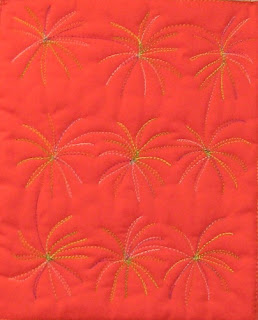
Then, I was instructed to “create at least one of the sketched compositions with one continuous line of free-motion quilting.” I chose my “fireworks” doodle for this exercise. When I looked at the finished project, I decided that the “fireworks” actually looked a lot more like the tops of palm trees! I think that is because I used a green variegated thread. If I had chosen a metallic or gold or white thread it might have looked more like fireworks—this IS a learning process. I do like the design, though, and I may actually use it on some future projects.
I have had fun “playing” with different color combinations for these compositions. I am using my color wheel and really thinking about the impact color has on the eye. Also, each exercise has forced me to focus on a design element to which I had previously given very little thought.I just got an email from Shelly. She included a few pictures of the exercises; she's doing them "with" me! I thought I'd share them with you. Check these out...
This is her "line drawing."
This is what she did when she was instructed to “create at least one of the sketched compositions with one continuous line of free-motion quilting.”
She calls it her "quilted sneeze!"
She also sent me a picture of one of her "Visual Texture" compositions. I think it is great!
Next week’s exercise is on “Color Relationships.” I’ll be posting my exercise next Sunday. Come on and do the exercise with me. It is on Page 43 of Lyric Kinard’s “Art + Quilt” book. I guarantee you will learn something.


No comments:
Post a Comment